MIAM RUS LLC was established as a representative office of a German manufacturer of pipeline valves and has now suffered from the imposed sanctions. The issue of repurposing and expanding the list of partners was raised.
An additional risk was the possible refusal to renew the license agreement, making it impossible, among other things, to use the registered trademark.
The company had managed to accumulate a reference list of deliveries, achieved some recognizability so the renaming issue was dropped from the agenda.
Since we have first-hand knowledge of the market it didn’t take long to immerse ourselves in the situation. In discussions we crystallized the directions, approaches and strategy. These were to be reflected in the new look.
Logo
The main requirements for it:
- laconism and minimalism, close to both us and the customer;
- simplicity of forms including for subsequent application to products by impact branding;
- the name is both readable and not (due to the peculiarities of registration as a trademark).
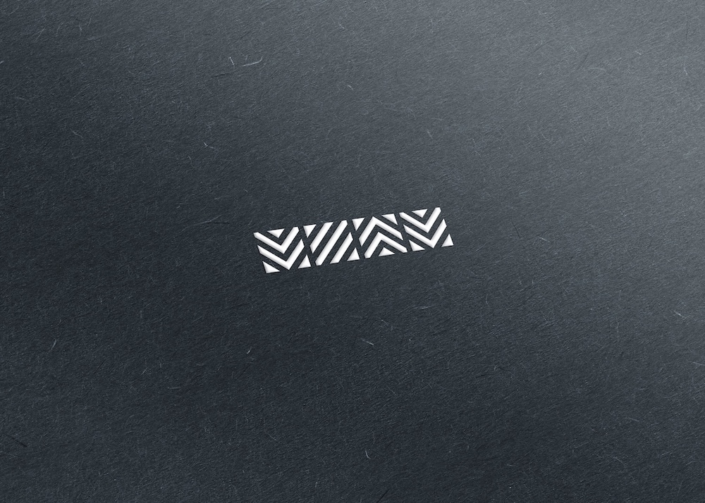
As a metaphor we have taken the heart of technical processes — all pipeline valves are designed to control the flow of working media, regulating it in the range from complete shut-off to absolute absence of influence. The variety of flows is formed by the technical characteristics of the working medium (aggregate state, chemical composition, concentration, pressure, toxicity, etc.), as well as the direction of movement.
The variability of destinations, the simplest and most straightforward aspect, is what we decided to emphasize.
Next. We highlighted the significant letters of the name — the first four, "МИАМ" (Cyrillic "MIAM"). The rest became a reference to the past, when the positioning of the company was closely connected with the German partner. In addition, people tend to shorten names in everyday life, so no one calls the company otherwise, leaving the official wording for documents.
Bottom line: a grapheme of four elements symbolizing the variability of threads that both read title and not.
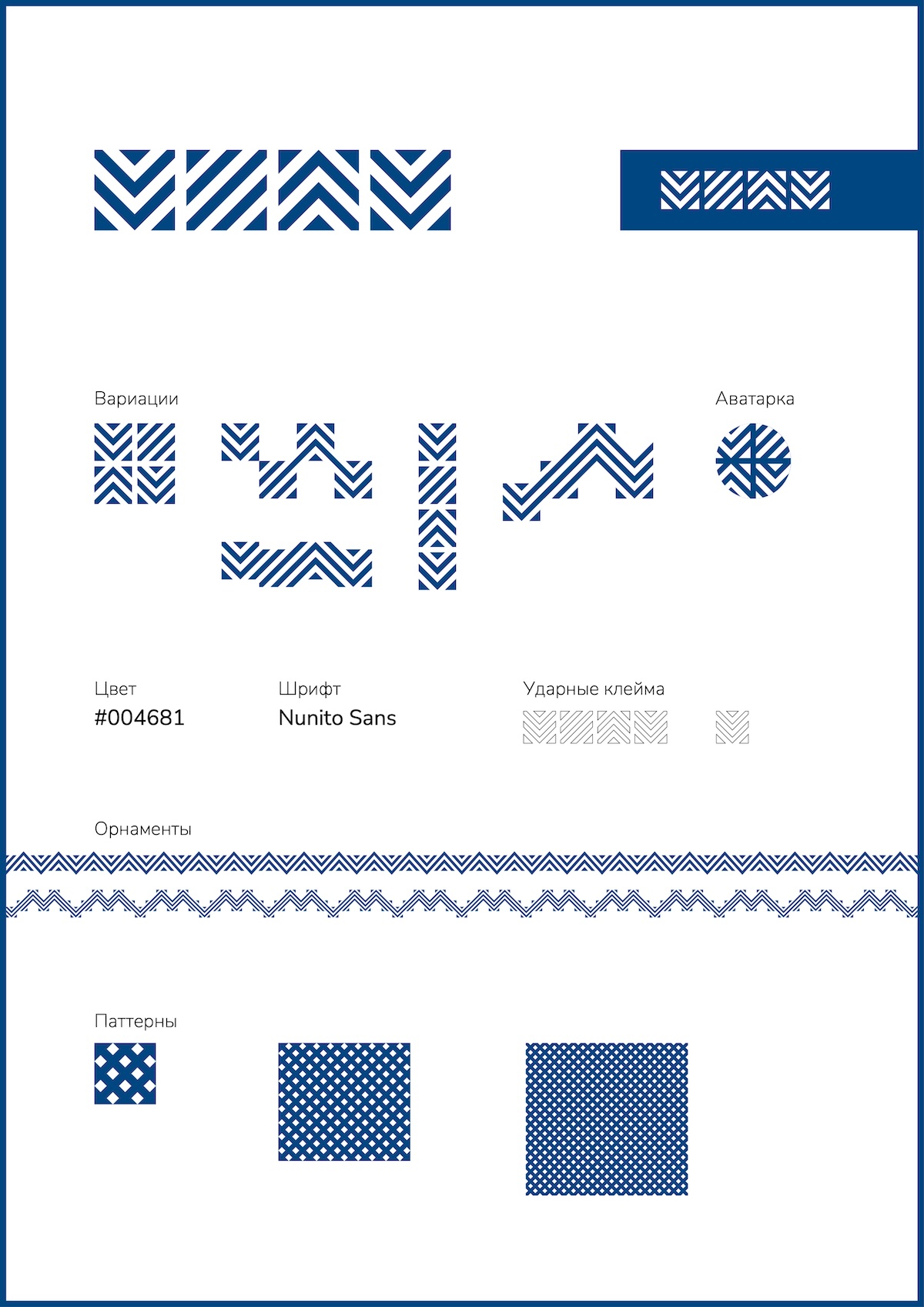
The multidirectional elements convey a sense of management and control over different environments and flows, which is perfectly suited to the specifics of the business.
It visually reads the letters "М", "И", "А" and "М": they are easily recognizable by sight, but not too literal, which makes the sign stylish rather than primitive. This move gives additional strength to the identity: the brand reference is visible even without text.
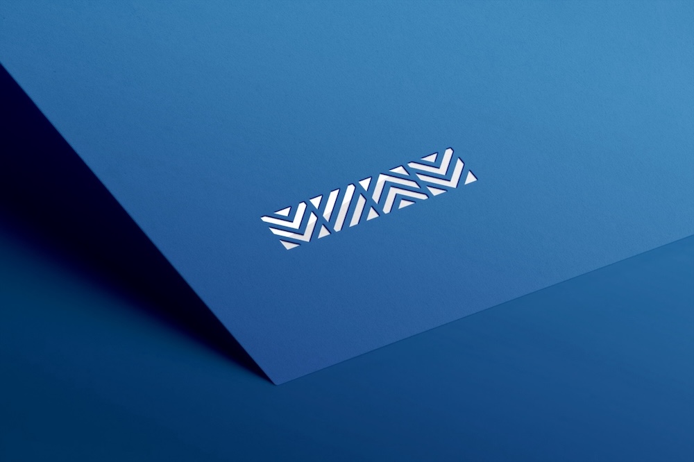
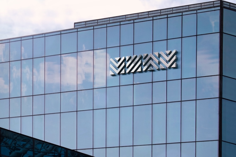
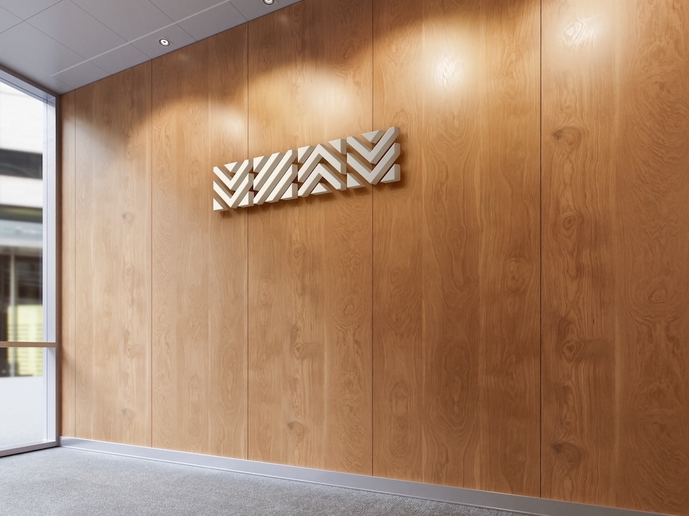
The logo works well both in small sizes, important for product labeling, and in large format due to its clean lines and contrast. It is easy to scale and use on any media from documentation and drawings to packaging and signage.
The clear geometric shapes and symmetry give a sense of stability and confidence, while the navy blue chosen with the customer reinforces associations with industry, the technical sector and reliability.
It’s easy to extract elements from the logo for patterns, backgrounds, icons and other company visuals, and its minimalism leaves room to integrate into any design without being overwhelming.
The logo was accepted by the customer and sent for registration as a trademark, in which we also took part by drafting the descriptive part of the graphic mark.
Slogan/descriptor
The best positioning of the company is determined by the slogan. To be more precise it should be such that the first time a potential customer encounters it and the logo, he or she immediately forms the right image in his or her head.
The company’s goal is to become not just another supplier, but a really close and caring partner who understands the specifics of the industry and shares the client’s difficulties.
The target audience with whom the company interacts is simple and easy to segment — technical and commercial specialists of customer companies, contractors and partners. We will not give a matrix, but will share the bottom line.
Your valves supplier. Brief, precise, with an idea and in clear language. It immediately introduces the company profile and establishes a personal contact, emphasizing the individual approach.
Corporate identity
We have developed the basic elements of corporate identity based on the above theses:
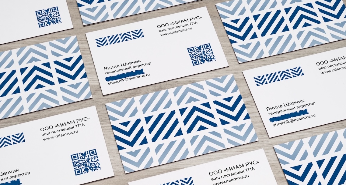
The best font for text is one that is not distracting with its "pretty" and perceived rather boring. The chosen Nunito Sans blooms in detail if you look closely and is distributed under the free SIL Open Font License. An additional advantage is that an outsider is unlikely to notice the difference from the standard font, which makes it easier to detect possible document forgery.
For the business card we have applied a standard for us move, which is not common. Usually, when others want to make information from a business card readable by a phone, they add a QR code with full contact information.
This is unreasonable since each byte of it is encoded by code squares. So, the more information it contains the more detailed it will become. It will have to be placed huge, because otherwise it may not be considered because of the abundance of small details with insufficient quality of printing or because of the wear and tear of the business card.
We generated a VCF file with all contacts and photos, placed it on the server and encoded only the link to it. In this case it is only 26 characters — some people have a longer first and last name.
We hosted the necessary couple of files on our server indefinitely and for free, setting up DNS and SSL certificate — our server is spacious, it will not notice the extra few requests per day and our friend has avoided the hosting issue for such a simple task.
At the same time, we never "bind" to us. With paid hosting we put the files and do all the necessary customizations on that side.
Yes, the suggested option won’t work without internet access. However, how many such places do you know? Moreover, the recipient will decide to scan the QR code either upon receipt or while sitting in his office — not likely during his/her vacation in Antarctica.
By the way, we have experience of making business cards with even greater functionality and reliability. For this purpose we used pseudoplastic instead of cardboard (in fact, lamination), between the layers of which we placed an NFC-chip. All contact information was recorded in it, which can be read by any smartphone that is not ancient. As a result, for a business card to become useless, it is necessary to make it unreadable by the human eye, QR-scanner and by means of NFC, which is extremely unlikely.
We have presented the form in a conventional way, but with respect for details that are usually overlooked. Our form is universal for single and multi-page documents. In the second case, a stylish footer appears on the pages following the title one. Yes, we often hear that it is not important, but the unwillingness to spend a couple of minutes to do competently using standard MS Word tools, in our opinion, borders on shoddy work.
Another important "detail" was the use of a tabular structure for the header and signature, which protects the layout from accidental damage. These aspects are also commonly overlooked, and companies end up sending letters that look like they were typed in a notepad with indented spaces.
A bank card with the details of the organization turned out to be stylish too:
Website and email
It makes sense that such massive changes couldn’t avoid the website.
The old one was developed on Tilda, then downloaded and hosted by the registrar. Acceptable, but not the best solution.
We redesigned it on the platform, updated the concept, structured the information, in the preparation of which we directly participated, and formalized it according to the new rules.
In general, our approach is to prioritize content over design. The site should be simple, complete and clear. It will not win a design award, but it is not created for a contest. The site should solve the issue with minimal means. The abundance of mindless animation, a lot of effects and "design for design’s sake" will always lose to quality content typed in black standard font on a white background.
Thus, the domain miamrus.ru was chosen, the domain and email were configured, and competent redirection from previous entities was implemented. At the same time we adjusted the set of services and tariff options. The expensive SSL certificates were replaced by Let’s encrypt, which eliminated unnecessary expenses. We also took into account all aspects of legislation regarding the processing of personal data and other local peculiarities.
The simple, solid and light structure leads the visitor along the route of interest. The accents are in line with the company’s positioning and vision, and the minimalist style, strict and technical, emphasizes them and is in line with the industry.
The website is powered by Tilda, which not only sped up development, but will also allow the customer to make any changes conveniently and unaided.
By the way, if you register using our referral link, at the end of the free period you will get an additional month on the selected tariff if you pay for a year. We recommend this platform for simple projects, contact us — we will advise you.
Conclusion
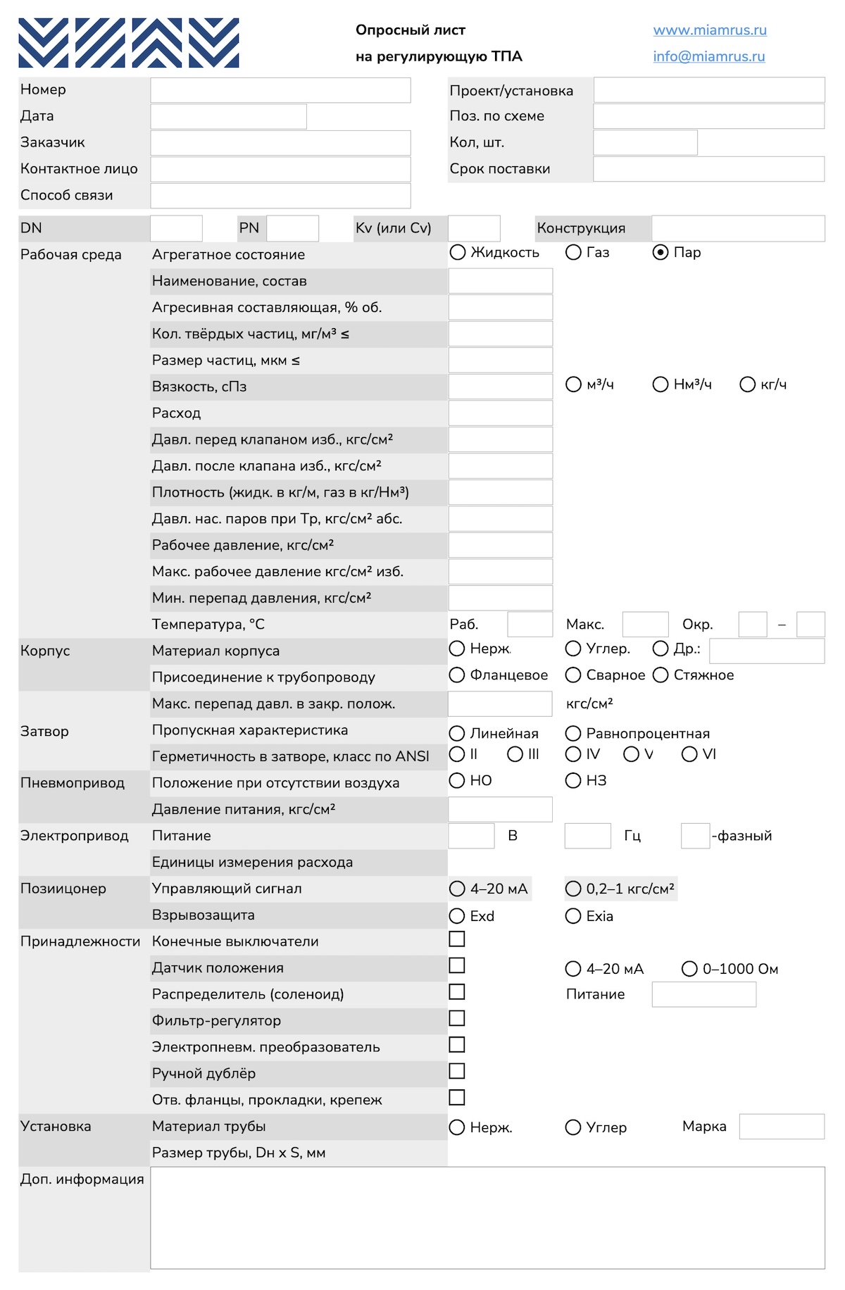
In the course of our work, we tried many non-standard technical solutions.
For example, to create adequate questionnaires in which the customer notes the desired options, it was necessary to master Libre Office. The final files became more intuitive and many times easier to fill out, which can be easily noted by comparing them with competitors' questionnaires. We have not released them for a number of organizational reasons and based on low feasibility, but the prototype is ready:
We can tell you a lot about the moves we use, but it’s better to learn them on the job.
Updated: in December 2025, the trademark passed all checks and was successfully registered.