MIAM is a supplier of pipeline valves. For a number of reasons it became necessary to update the corporate identity.
The task is not easy: on the one hand, it is necessary to maintain continuity, but on the other hand, the new sign should be as different as possible.
Looking ahead, we note that the variant proposed below, although it was to the customer’s liking, the “dissimilarity” problem has not been solved. Therefore, we have already developed a new version which is being tested. We will tell you about it in a few months.
So, in solving the task at hand, we first turned to the existing logo:

The recognizable element is a symbiosis of two "M". It is not known what idea the author of the logo put into this approach, but probably he meant some synonymy of the infinity sign.
We have taken the given technique and domesticated it, breathing in the "right" meaning.
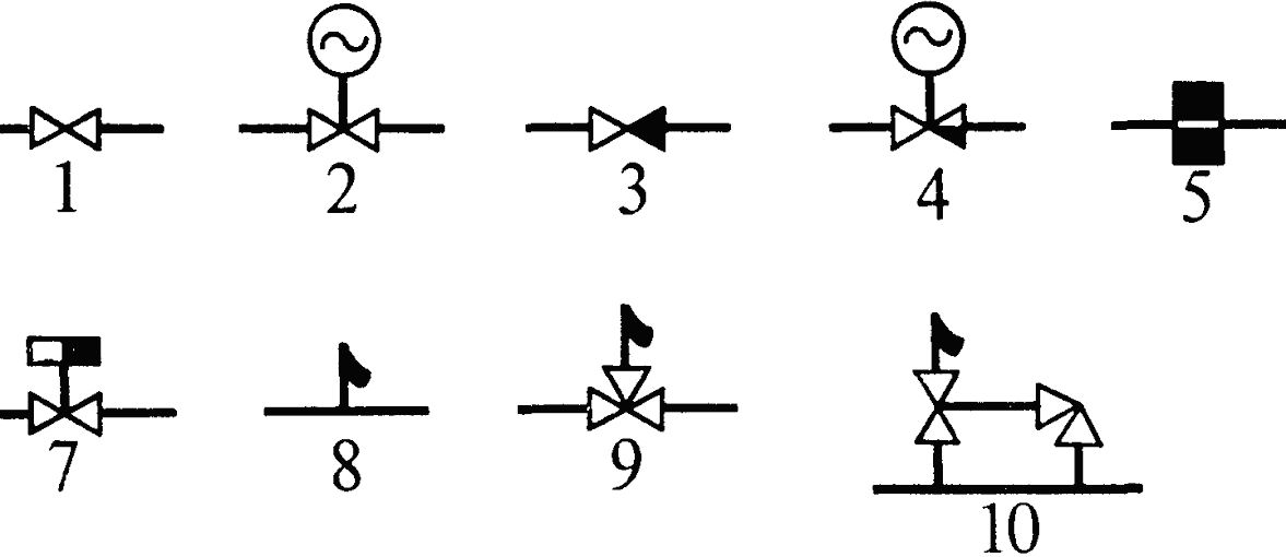
This is what the pipeline valves look like in the diagram:

These two conjoined triangles are the base from which the concept is built:

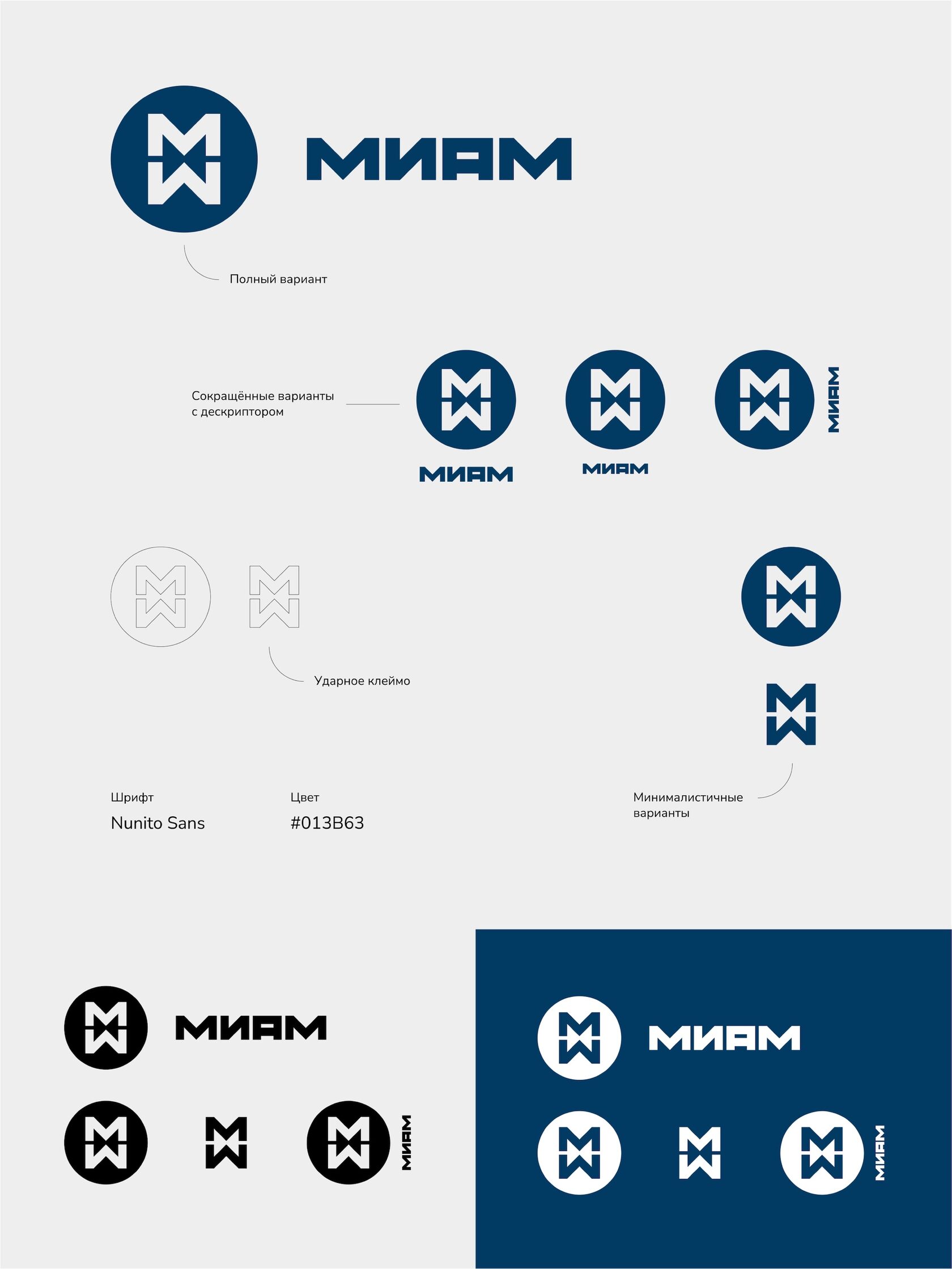
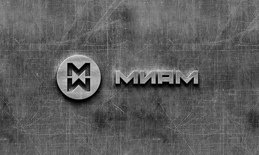
By incorporating the valve symbol into the "MM" grapheme and matching it with the font part, we got a stylish, fresh image that the customer immediately liked.
As we noted above, work with this option has been stopped at this stage. But the company will definitely get a new face, stay tuned.

