Until other works are ready to be published, thought we’d share the routine.
Design is related to being forward-thinking, constantly evolving and trying new things. Often, when we get to know interesting people/businesses, we make sketches of visual images that suit them in the background. Therefore, watching Ed Halilov’s videos, we took a parallel look at his branding.
All it takes are an iPad and an hour-long interview on the freshly built embankment after sports.

Ed is a blogger, survivalist, author of techniques and courses, and is in the business of taking modernity’s pampered individuals into unfamiliar environments where they have to bare the basic skills laid down by nature.
Disclaimer: we only evaluate aspects of the activity with which we are familiar. Political and other aspects are unknown to us and remain outside the scope of our review.
Ed’s approaches are close to ours, the concept is clear: building a culture of safety.
In general, survival is about minimalism, even asceticism, when you don’t have anything extra with you. Hiking is about overcoming, setting the vector and direction of actions without unnecessary fuss. And the logo should fully reflect these aspects.
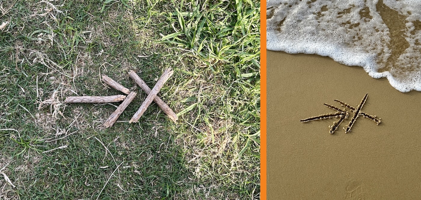
Chopped, ascetic and unpretentious, which can be put together even from twigs from under the feet — initials ("Э" and "Х" in Russian) stylized as an arrow and a destination point in thematic colors from the existing palette:


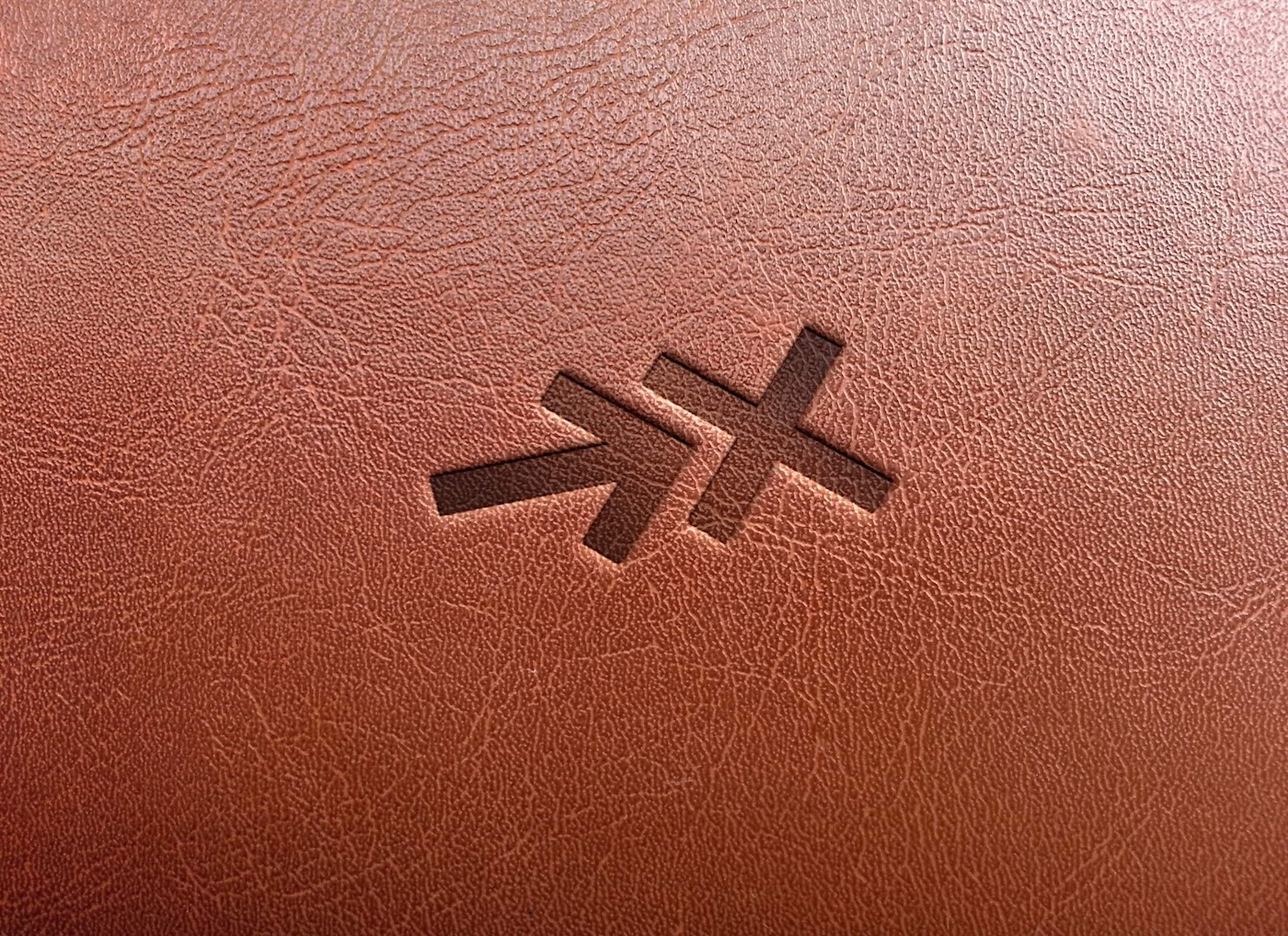
The power of the image is in its simplicity and variation:

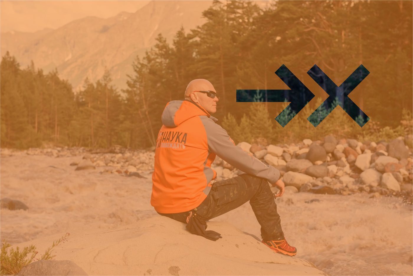
The inherent flexibility allows the logo to find its place everywhere and take any shape:

It can easily be applied to any surface in four short strokes, such as on sand or with a knife on a wood, or even put together from branches:
Projects, courses, "Science to Win" club — all areas can be designed in the same style:

A tribute to the professional activities of Ed Halilov.