The name "Titan" was coined by the company’s CEO, who imbued it with so many meanings, associations, and allusions that it would take a long time to list them all. At the time, however, the company did not yet have its own visual identity.
Titan supplies industrial equipment. The company wanted a logo that was minimalist but not bland; versatile but not impersonal; meaningful but open to new interpretations.
First, we determined the direction in which the brand image would evolve. Part of the project’s context could not be disclosed publicly, so instead of directly depicting the product, we turned to the metaphors embedded in the name itself:
- Titan is Saturn’s largest moon.
- Titan — an object of unusually large size, power, or significance.
- Titan — the second generation of gods in ancient Greek mythology.
- Titan — (from the Greek τίτανος) "white earth," clay, or gypsum.
- Titan (Titanium) — a lightweight, strong, and corrosion-resistant metal.
We could have developed a cosmic, mythological, or grand interpretation of the name. However, we decided to stay closer to the company’s industrial context and chose metal as the main conceptual foundation.
By this time, Titan had secured a domain name that naturally linked the company’s name, the metal, and its future visual identity.
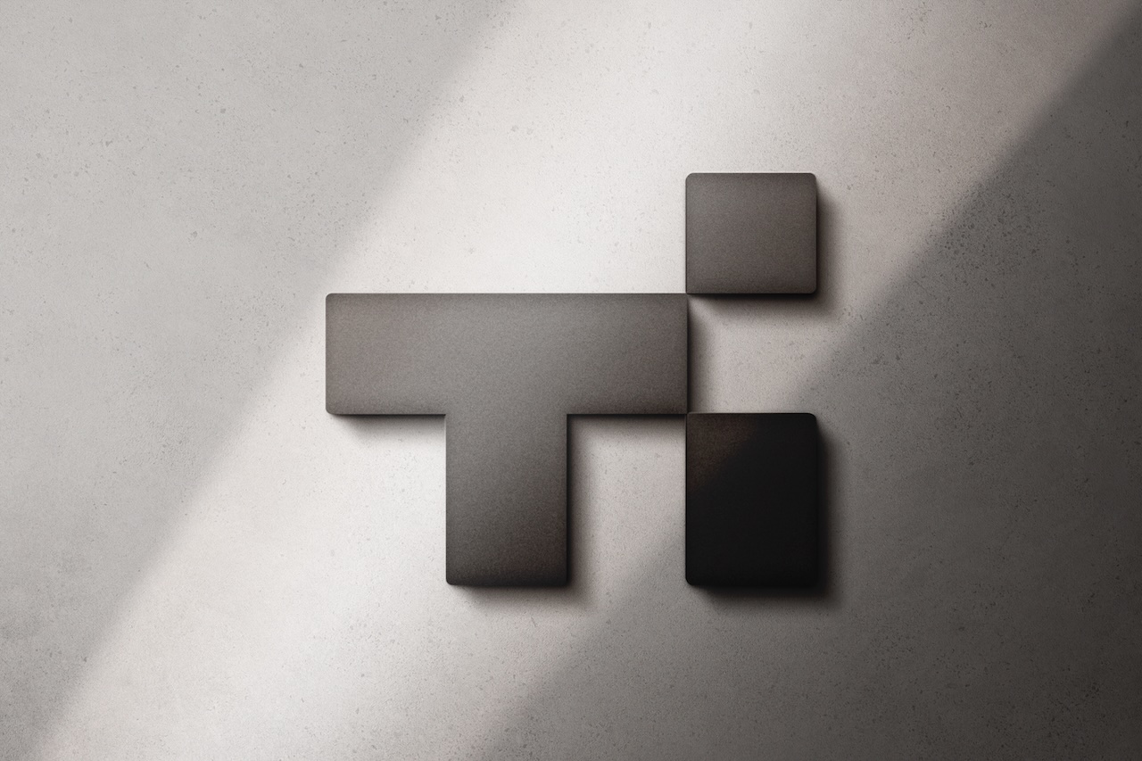
The logo is composed of several simple geometric elements. A bold "T" forms the basis of the composition, while two rectangular modules form the lowercase "i" and complete the monogram.
The structure follows the logic of industrial design: each element has a specific purpose, occupies a precise position, and functions as part of a unified system. The wide horizontal "T" is perceived as a load-bearing beam, the vertical element as a support, and the modules on the right set the rhythm and balance the overall mass.
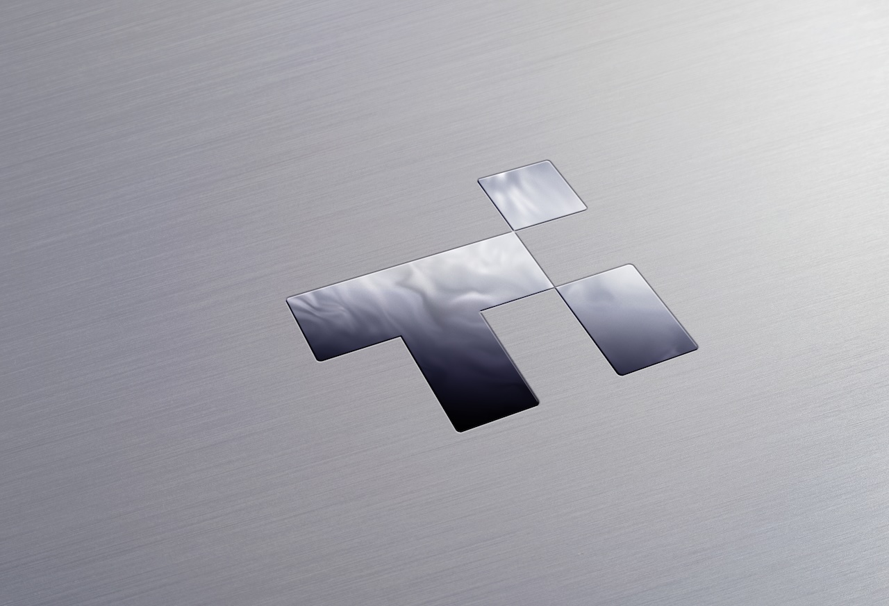
The logo’s industrial character emerges without literal depictions of equipment, mechanisms, or parts. It is conveyed through the weight of the form, the modular construction, the precision of the joints, and the sense of a physically assembled object. It seems as though the logo was not drawn but rather constructed from separate elements.
The bold geometry lends the design a sense of reliability and solidity without making it appear heavy. The rounded corners soften the design, add fluidity, and make it appear more serene. The contrast between the large "T" and the compact "i" creates a distinctive silhouette and helps the logo remain recognizable without the need for additional imagery.
The result is a concise and versatile logo — technologically advanced, stable, and cohesive. It is specific enough to convey the company’s industrial character, yet open-ended enough to take on new meanings over time, as implied by the name "Titan".