Bonbon Haifa is a chocolaterie with a history, demonstrating that the Israeli atmosphere goes well with Belgian chocolate.
Inessa, a chocolatier, offers handmade desserts, both standard and piece:
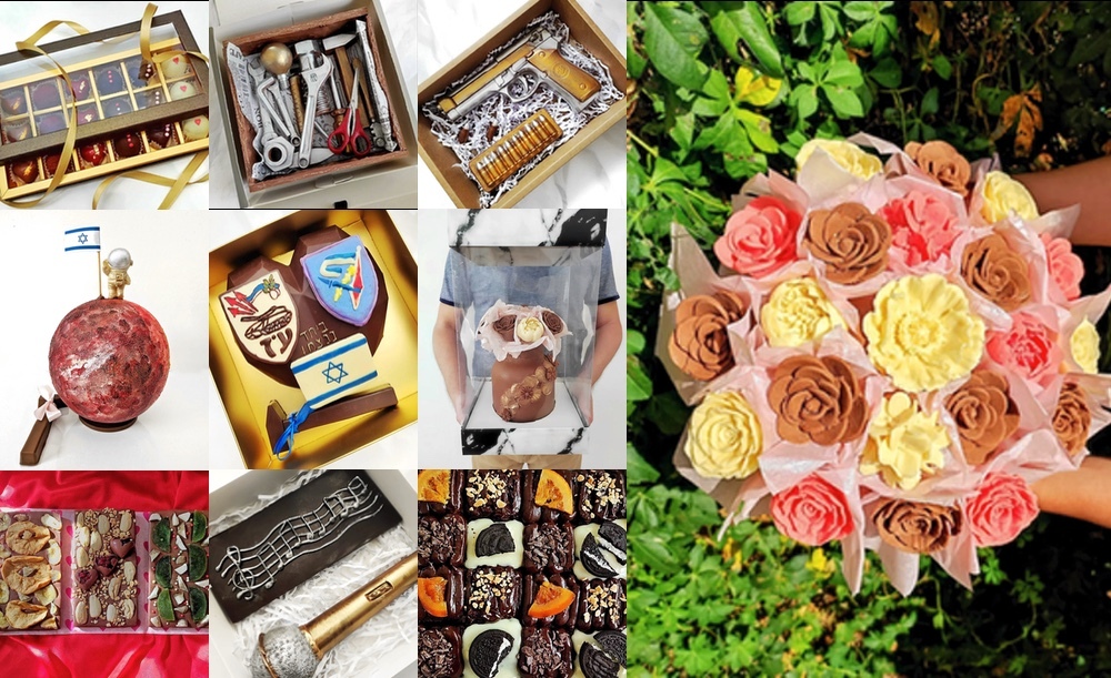
Each work is unique, only the warmth of hands and attention to the client’s wishes remain unchanged. The company is also distinguished by a truly caring service of a level that is unusual in Israel.
The task is to increase the average bill — a significant increase in the number of orders is not required due to the existing workload, but increasing profitability has never hurt anyone.
We investigated the technology and the market, evaluated the target audience segments and the benefits of Bonbon, and jointly developed a marketing action vector.
One of the steps is to move the brand to a new echelon, to give it the signs of elitism. Therefore, we decided to keep the name in the Latin as the most universal, meeting the required criteria and bringing a European flavor. We also decided to move away from handwriting as it is used everywhere in the industry.
In the past, gold and monograms were symbols of elitism. Now expensive = minimalistic, bright and fresh. Emphasis on the boldness of shapes and the richness of the color palette.
The name is non-unique. Bonbon is a chocolate-covered candy with fondant filling, sometimes with fruit and nuts. It was necessary to distinguish from companies of the same name.
We took the name, typed it in a minimalistic way, making each letter unique. We added a geographical reference as it clearly identifies the company, is already in common use and refers to the Israeli market. We placed it in a square symbolizing a piece of chocolate and chose thematic colors:
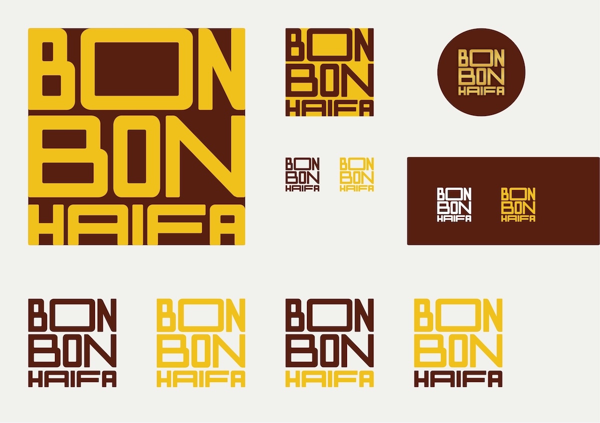
Seeing first finds a bar of chocolate in the hole of the top "O". Great, new meanings!
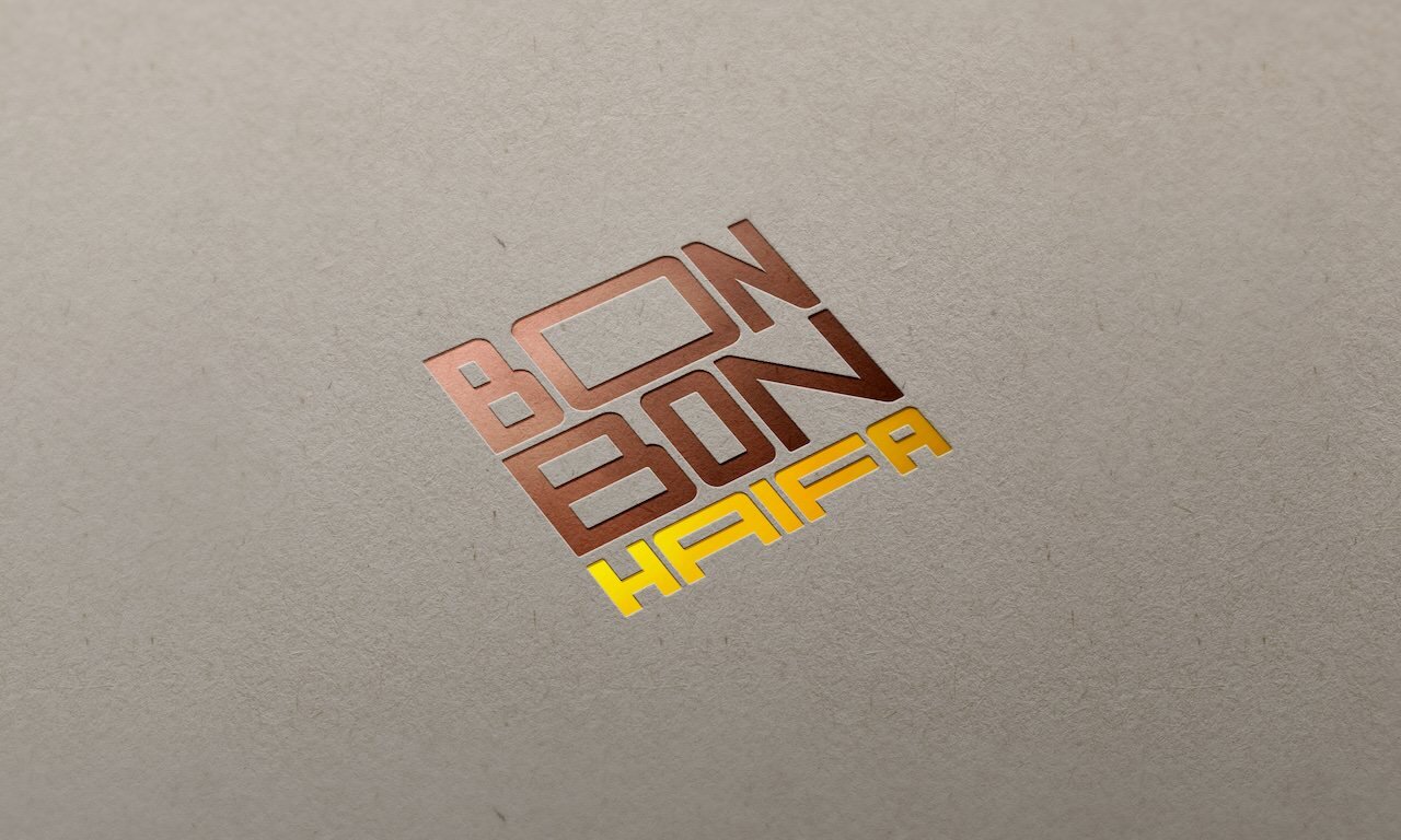
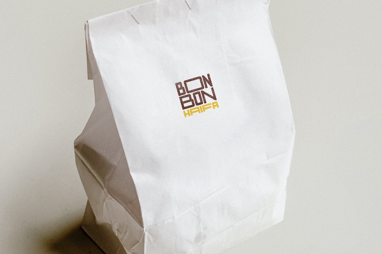
Working in the premium B2C segment, it is especially important to create an image of solidity and exclusivity. Every element, starting with the logo, should contribute to this. We believe we have succeeded.