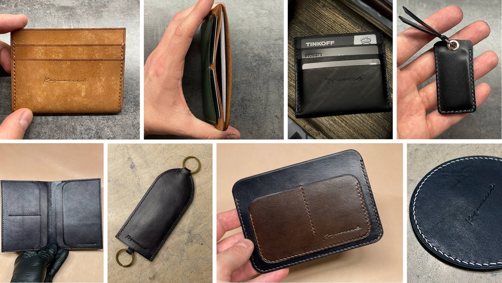
Having grown his business from a hobby, Vlad makes leather goods: wallets and purses, card and document covers, belts, etc. As orders grew, he began to think about branding.
At the time of contacting us, Vlad was branding in the form of his surname, but found this option too long and not beautiful enough:
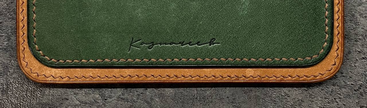
The issue of "beauty" will be discussed below, but there is a technical nuance with the length — this option is not applicable on small items like a case for an intercom key. The second technical aspect is the method of branding: a special brass cliché, heated to 180 °C, which is held on the skin for 5−7 seconds and leaves a trace.
Bottom line: naming, logo and stamp layout required.
Naming
We initially noted that it is quite rare to find businesses bearing the founder’s name. This is a strange circumstance, because it is a ready-made brand that motivates and disciplines, humanizes the business, increases the owner’s responsibility for the quality of work, which a priori increases trust in the business and customer loyalty.
The handicraft business, which grew out of a hobby, is entirely linked to the craftsman. Of course, it is possible to come up with a different name, but the surname looks as appropriate as possible. Especially in our case and with the surname is unspeakably lucky — Russian noble, leading the history of the XVII century. And we can’t even talk about the perfect combination of a handmade purse and the "Treasurers" branding!
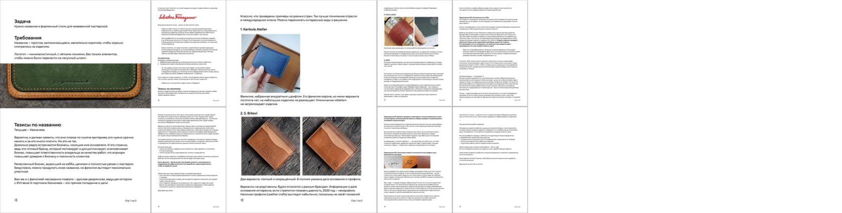
This technique is used by Salvatore Ferragamo, as well as a number of artisans and ateliers, which the customer himself has cited as an example.
We analyzed them and shared the results:
As a result of analyzing the proposed theses, as well as long correspondence, Vlad decided to reject alternative approaches: abbreviations/abbreviations with reference to (first and) last name of the master, as well as a completely new word/letter combination like "K13".
Logo
Since the decision on naming was made, we turned to the logo. The previous one was typed in "handwritten" font, which confirms the complete identity of the repeated "a" and "e". The approach has a right to life, but, in general, it looks rather fake — why mimic a personal signature when you can use a real one?
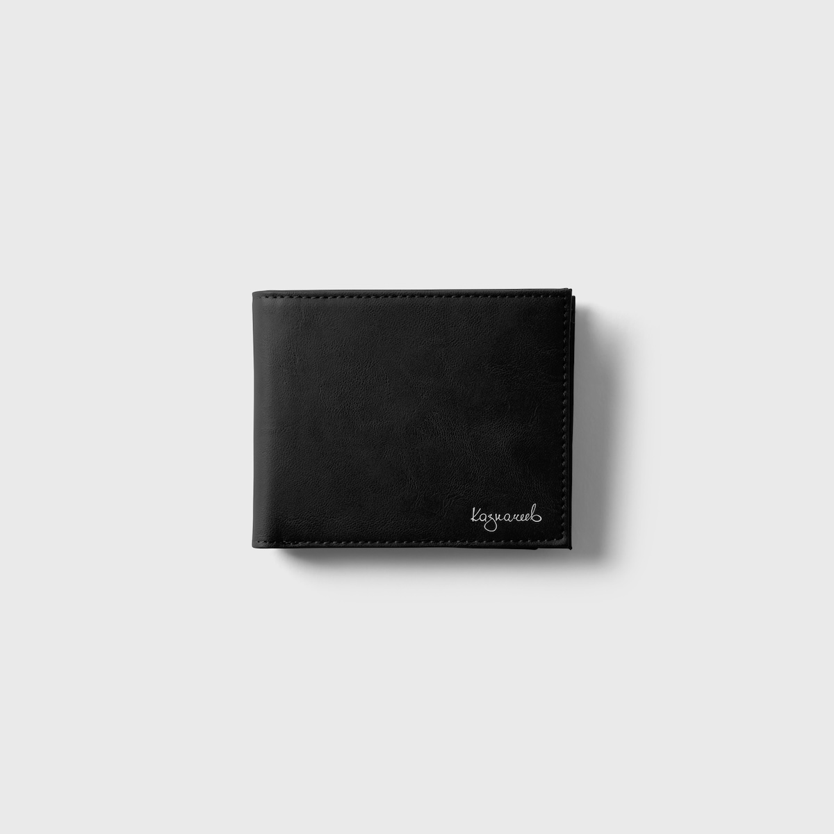
As for the length of the logo, we decided to develop two options: full and compact — to be applied depending on the specific situation.
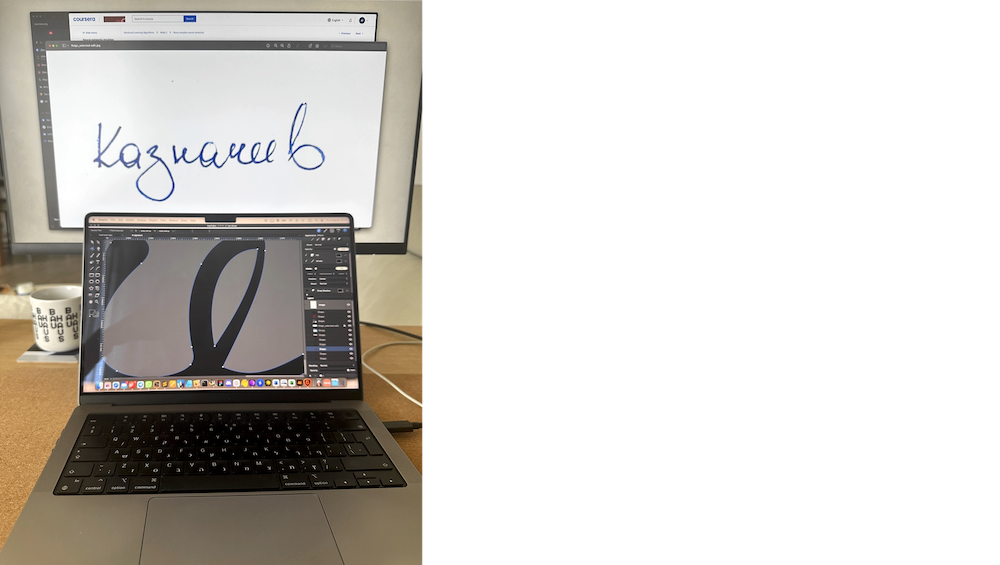
We asked for the last name to be handwritten several times:

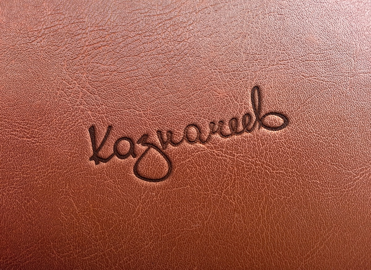
The fifth variant seemed to be the most suitable due to the characteristic "K" and the weighty "З". We drew it in vector, making a number of corrections that do not infringe on individuality — we left the "З" separate to emphasize the naturalness of writing and lightness, as well as aligned the line of writing:
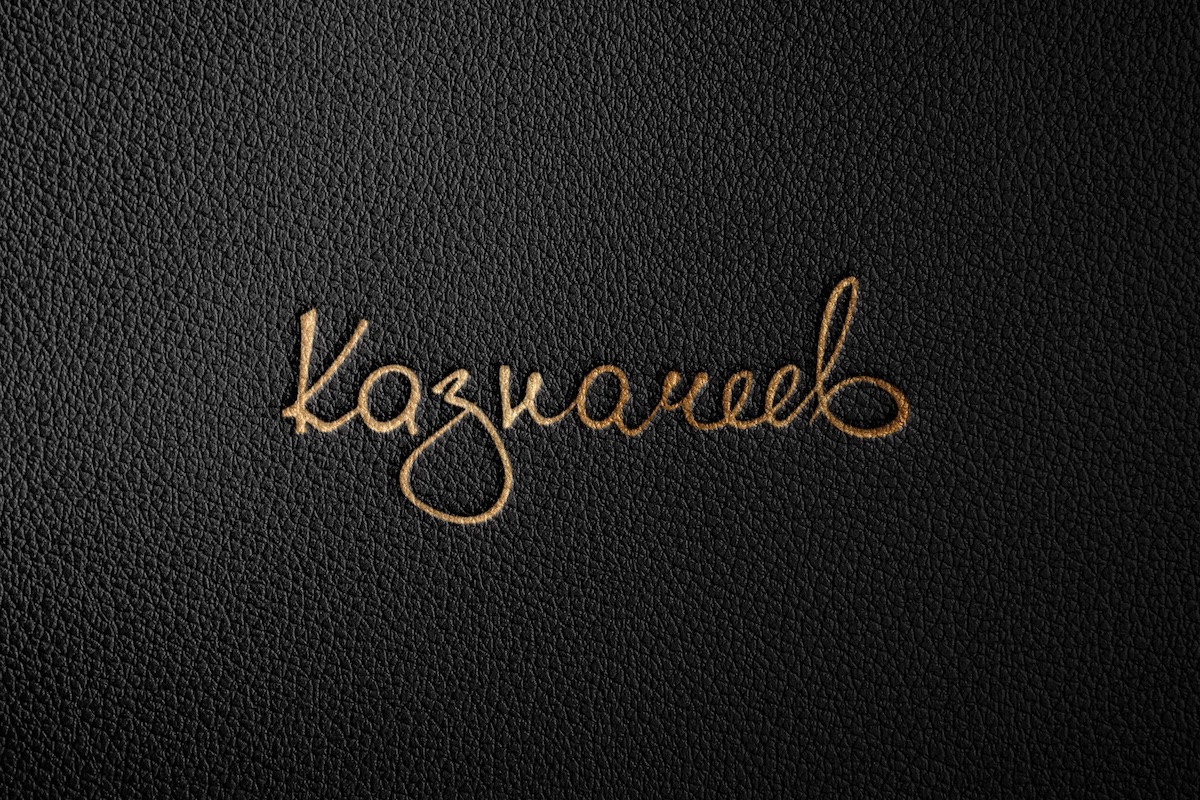
The final sign is based on the actual handwriting, preserving its personality and conveying the brand’s style.
We kept the naturalness of writing — the logo looks alive, not artificially drawn; optimized the balance — the letters are harmoniously combined, there are no skews in height and thickness; made it readable and expressive in any format and color version:
Such "K" is not found in any font, unequal "a" and "e" emphasize the unconventional, and ornate "в" successfully completes the composition.
It’s not just text, it’s a master’s signature embodied in a logo. It’s not as "perfect" as a typed one, but it’s unique, distinctive and therefore really cool.
In order to move on to the development of the compact version we needed a customer’s wave. Unfortunately, he disappeared, so work on the project was stopped.
We regret that the project was not completed. To dive into a new topic for us we studied the market, production technology and immersed ourselves in the customer’s vision. In dialog with him, in addition to naming and identity, we touched on positioning, target audience segmentation and other aspects that we planned to develop into a full-fledged brand development strategy.
P. S. Vlad Kaznacheev kept silent, deleted our correspondence, renamed the channel and blocked in it, if we find it (and we found it ;). Baseless inadequacy…