For the past month we have been engaged in a complex project. Fast Track Delivery is a logistics company based in Gush Dan, handles deliveries throughout Israel from Haifa to Be’er Sheva.
Having met the owner, who had experience in the industry and decided to launch her own project, we matched spirits and started working on the development of the company.
The starting conditions: a number of customers, contractor drivers and a vision of what the company should become.
Of course, we started with analysis. Having taken trial routes (one-off and prefabricated), we got a feel for the mood and approach, and once we got to know the team, we realized the prospects.
The first step should be simple — the company needs a face, and the existing logo didn’t really fit:
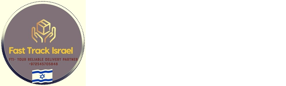
We created a new one with a base of emotion brought by the brand:

The owner of the company wanted to see the box as a metaphor for delivery. We stylized it in isometrics, adding the image of a courier handing over a red-orange parcel. The handwritten letters pei (פ) and tat (ט) from the Hebrew abbreviation were also sewn into the grapheme.
Demanding is always to our liking, so we are only happy with intermediate options that are not accepted:

The color scheme was chosen by steering away from companies that could be perceived as competitors — blue Wolt, black and yellow Yango, leaving the market, orange 10bis, etc.
The jointly formed strategy clearly sets the company apart from existing players, but those are the details.
The logo took more than a week to come to life, but in the end, both employees and customers loved it. An existing client, a Belgian chocolate gift manufacturer, presented his creation as a token of appreciation for his work:

This human attitude with sincere gratitude and became key in the decision to cooperate.
Then we paid attention to the domain name and website (naming was left outside the scope of work) — "FTI" is consonant with fintech acronyms, and "fti-delivery.co.il" is long and complicated — eftiihyphendeliverykoil (in Hebrew and Russian it is not simpler).
"FTD" and "ftd.co.il" were approved from the get-go. Next was the website. The previous one was created on Tilda, which we support, since for the vast majority of simple tasks this constructor is more than sufficient:

The main minuses are: stock bad photos, banal slogan, empty texts — all this does not convey the mood, does not solve the task.
We took on the task of developing a simple business card site. We realized the reason for the lousiness of almost all Hebrew sites. It’s a really painful job — right-to-left text and block layout require special attention and the use of corrective scripts.
The result, with a minimum of graphics (original in preparation, current work by Midjourney), trilingual, complete in nature and prepared for the inevitable coming refinements is ready: https://ftd.co.il/en.
At the same time, we changed the slogan to "Free to desire", denouncing the essence of existence — to allow partners and recipients to spend time on what they desire instead of worrying about building logistics or nerves from waiting.
It’s especially gratifying to work with FTD, seeing the speed of innovation. During the logo development, even before the website was finalized, a number of advertising banners and even corporate T-shirts for drivers were prepared:


Having finished with the external, we started on the main thing: the IT system and marketing both external and internal.
Having familiarized with the current system from all sides, having carried out possible improvements, unfortunately, we came to the conclusion about its further inapplicability for a growing company.
We have formed a list of requirements, are studying existing solutions on the market, and are holding calls with developers.
In parallel, we participate in strategic sessions to attract suitable drivers, new customers and retain existing ones. Approaches have been formulated, a bonus system has been developed, and benefits have been outlined. The task is particularly interesting due to high competition and the departure from the market of a strong player — Yango.
This project, because of the deep involvement, is becoming more and more significant — a work in progress!