Julia Strauch is a licensed translator from Russian to German and vice versa.
In our opinion, the current logo does not reflect German neatness and pedantry:

We’re sure it can be better, keeping the color palette she obviously likes and endowing it with the aura of clarity and rigor inherent in the profession.

A simple grapheme of J and S assembled in a pen as a symbol of word processing.


In the meantime, we came up with a cool marketing move. It is always nice to receive something stylish and useful rather than a package with fancy advertising.
In our case, the customer receives a qualified, authorized translation on paper. The document is rarely a single sheet, but even then it is logical to transfer it with the original document. A branded polypocket — yes, but it gets crumpled, torn, quickly deteriorates, or the documents continue to be stored in it, tucked away in a faraway drawer.
There is also a long-lasting version that can travel from place to place. The idea was inspired by an Ampelmännchen souvenir bought in Berlin:

Ampelmännchen is the original symbolic image of a walking and standing man wearing a hat, used for traffic signals at crosswalks in East Berlin, the capital of the German Democratic Republic since 1961.
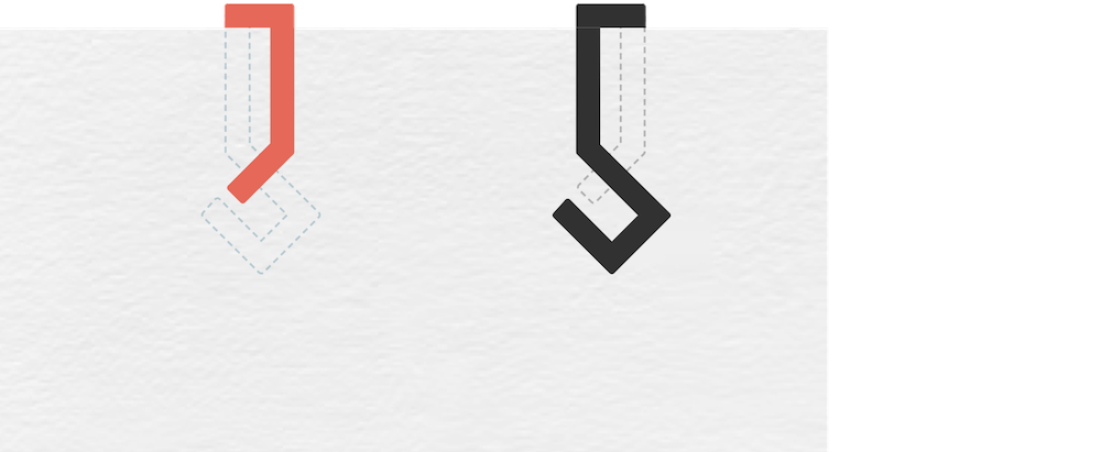
Julia should have a branded paper clip, the layout of which was prepared:

Depending on which of the parts is the front, you will get one of the initials. In this case, the recognizability will be preserved, regardless of the method of manufacture: colored wire or plastic plate.
Such accompanying ideas involuntarily appear in the course of the work. And we are always happy to share them, allowing the logo to grow inside the brand.
