Back on the seemingly long-defunct Threads, Andrei Kurochkin popped up in the feed. It’s addictive (not sure if that term is appropriate for knitting, but…).
Andrei Kurochkin is a knitter, author of books and courses. He doesn’t just popularize knitting, he really breaks the gender stereotype: from now on, knitting yourself a sweater is cool for a successful man, not just acceptable for a grandmother.
The emotions were so contagious that I wanted to take the course. The only thing that scares us is that there are a lot of nuances inside — transitions, joints, edges — we don’t have an understanding in my head yet. How to choose the technology and method, calculate the sizes and rows, all those stitches, cast ons, facing loops and turning rows… Obviously, that’s what the courses are for. And the abundance of feedback even from men who have mastered knitting a cardigan is encouraging.
For now, just want a "Cardiganische" from the hands of a master =)
But we’re talking about marketing and design. We’re also about caring. If we like a product — we draw a logo. Even if we didn’t ask for it.
Of course, Kurochkin’s is already a brand. And it has a face. The only thing missing is a suitable logo. And having been energized by this energy, you want to see the author’s mark on the ordered creation.
While writing this post, Andrei posted a fresh photo of a package with a silhouette of a chicken. It was also glimpsed in a couple of other photos. It turns out that this is an existing logo. But for some reason it’s not widely used. And since the work has already been done, we will not urn it.
That’s how the impulse came about. Not an order. Not a brief. Just a desire to respond.
The story of one symbol
The project is run by the Kurochkins Andrei and Tanya. So we don’t look at the name and start from the surname and the brand "Kurochkin's".
The sign was not born instantly. Like Kurochkin’s work, it emerged from the threads — literally. At first, the idea was to combine the letter "K" with the feeling of knitting. Not illustrative, not head-on, but real: through structure, rhythm and tension.
And then one day the line started on its own. Without blueprints and calculations — like a loop that found its place in the fabric. This is how the symbol appeared, in which the "K" became a knot, a weave, a movement, the beginning of knitting. It does not copy a thread, it behaves like a thread.
Kurochkin’s is not just about a person who knits. It’s about a craftsman who understands the material on a molecular level. He knows how the yarn lies, where the loop is pulling, where the thread wants to curl — and gives it a path. It’s the same in this sign: it’s not imposed, it’s not constructed — it’s connected, almost intuitively.
It does not strive to be understood by everyone. But those who are "in the flow" will see in it the shape, the movement of the hinge, the precision of the fit and even the slightly ironic austerity that is in the master’s work.
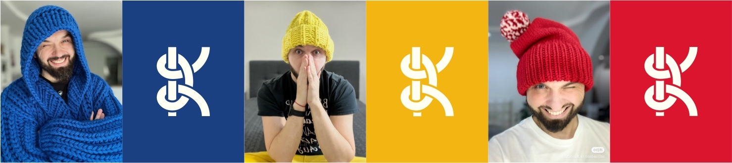
This sign is not a craft, it is a system level design. It has several color schemes for different series, emotions and contexts.
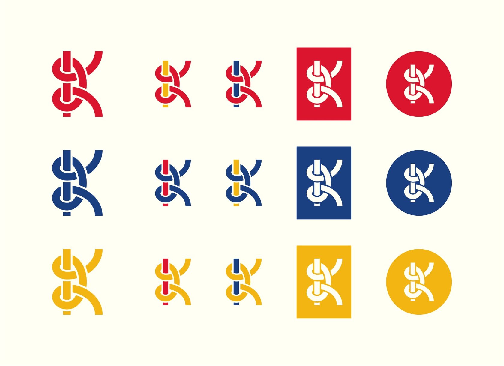
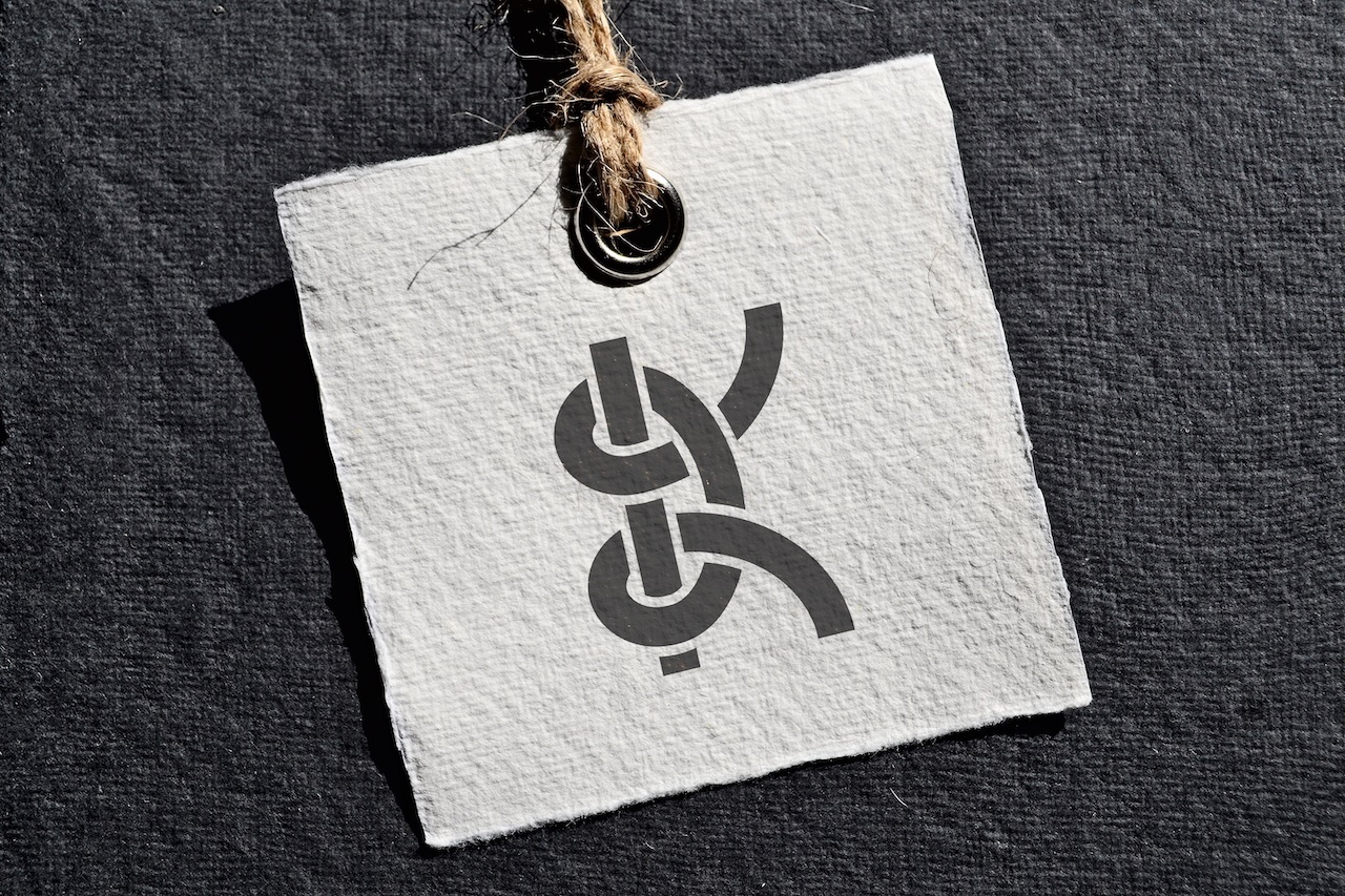
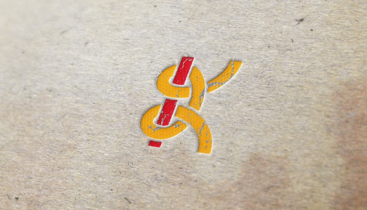
It works in pure form, in inversion, as a tag, as a pattern, as an avatar. It can be embroidered, printed, embossed, knitted — it lives in any format. And in doing so, it does not speak a word. Just a gesture of the form, as if whispering: "yes, it’s Kurochkin’s."
Maybe it’s just an outsider’s view. But if it turns out to be in harmony, it would be an honor if the sign finds its place on the product. Or just in a ribbon. As a response. As a thanks.
The sign does not imitate — it continues, turns knitting not into a picture, but into a thought. It has an idea, a craft, a recognizability and a respect for the craft.
It’s not just a sign. It’s a K tied into an image. One that can be worn, whose appearance will be a milestone in the brand’s history.