The task is to make a logo for the software used for calculating parameters of regulating pipeline valves.
Introductions: the name chosen is KiVi (as coefficients). There were no special wishes, just to make it cool.
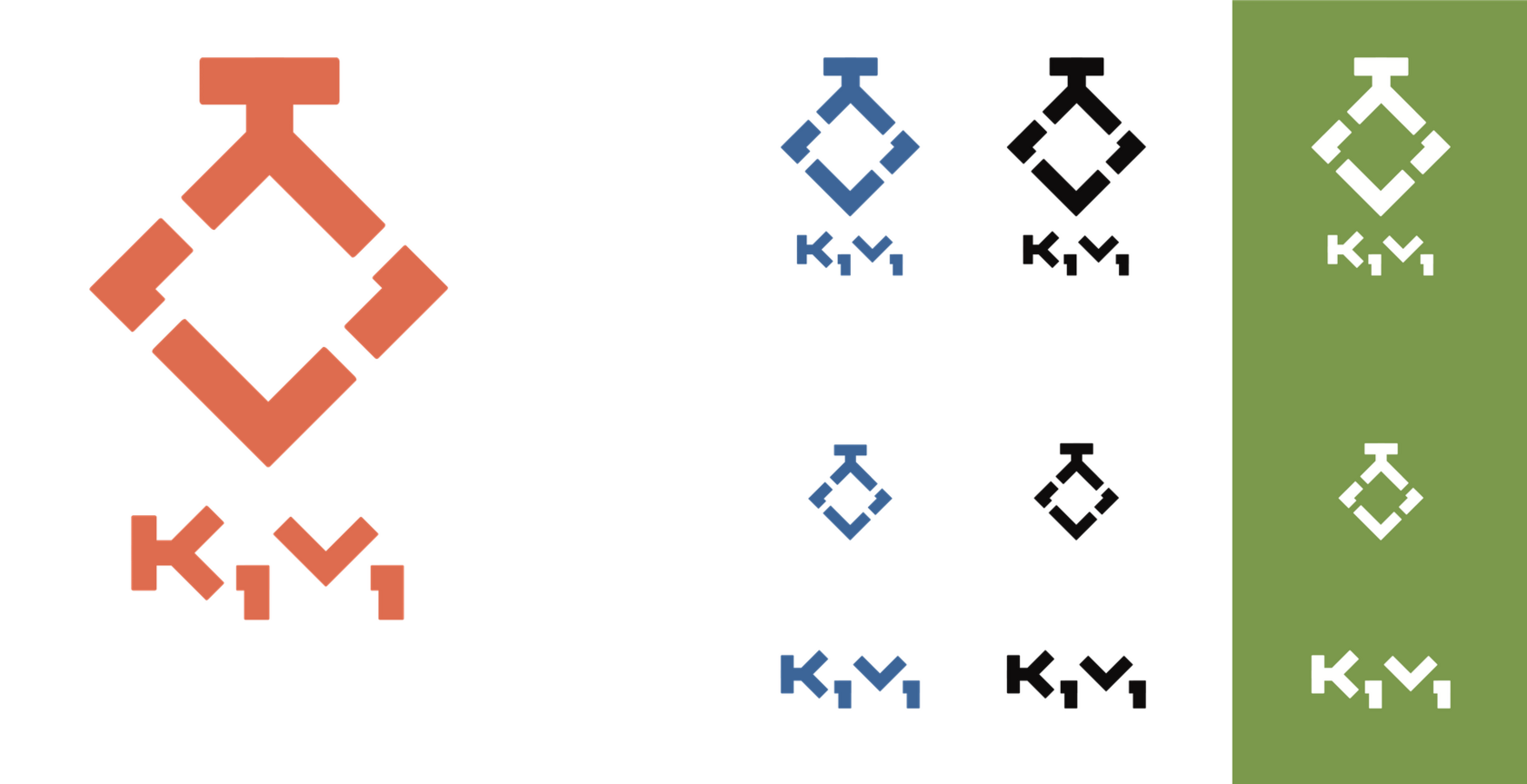
One of the many options under development reached the demonstration stage but was not accepted by the customer:

A schematically depicted valve consisting of the letter elements of the name.
Well, no problem, let’s think further. I wanted to play the kiwi bird, although the correct Latin spelling is with a "w" and not "v". But "googol", which is the basis of the name "Google", is correctly spelled "Googol".
The original idea of the authors was a bird, and the final name is a mixture of Kv, the designation of flow capacity, one of the key parameters of control valves, and the average spelling of various parameters with indices.
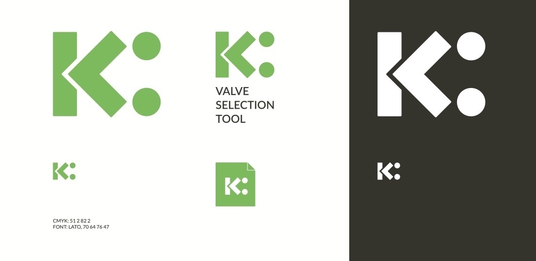
After rethinking, the second variant was born, which came to the customer’s liking:

It’s got "K", "V" and tittles from "i" all at the same time:

In addition, a sign turned 90° is a bird regulating the flow in a pipe with its beak, or two seated people shaking hands:

The last metaphor refers to the task of the developed software to become an assistant for engineers of both the customer company and its partners.
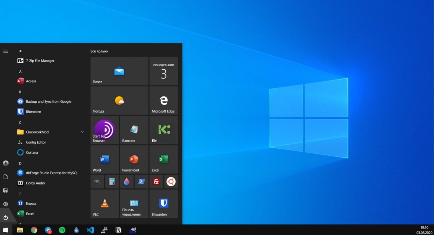
This is how the icon will look in the Start menu:

And a branded flash drive:

Unfortunately, the issues of architecture and UI/UX design are left to the developer. Therefore, the end result will be a Windows application with an interface "from engineers for engineers".
It’s not for us to judge, but it’s hardly the right decision. Anyway, we wish Kivi to become a worthy product!
