Recently the presentation of the valve company Armsimple came to our attention. Having a soft spot for the topic of branding and machinery, an industry to which more than a dozen years have been devoted, we couldn’t pass by.
The situation with the logo was accurately described earlier in the note about self-design. It’s not surprising, the company has just been established, the staff is minimal, the market dictates the requirement to start production as soon as possible, so the "question of the picture" was secondary.
We talked to the co-owner of the company, learned more about the goals and current status, principles and approaches used, corporate spirit and development strategy — there was no doubt, we must help to give the company a technological face.
In brief, Armsimple is engaged in mechanical metalworking and a number of related services. From the very beginning the company has been competently built by young, but reputable professionals. They bet on technological solutions and a properly selected team of enterprising specialists. Money is invested point by point in the narrowest "bottle necks", but without excessive savings, with an emphasis on development. There is no bureaucracy and in case of emergencies the management personally stands behind the machines. This approach deserves sincere respect.
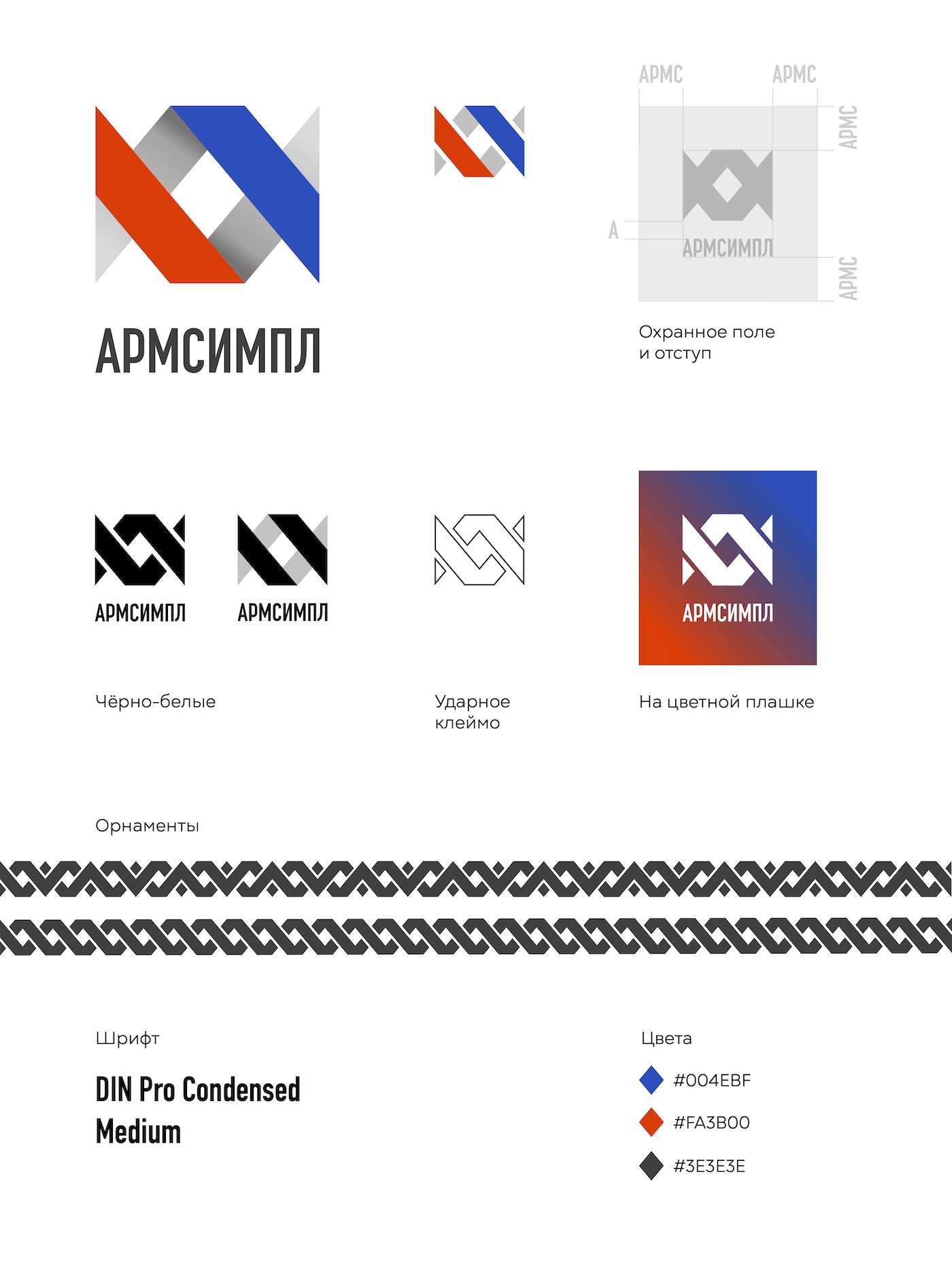
Having learned that just the other day an application for trademark registration was filed, we decided not to waste time in vain, suggesting minor changes that could still be made to the application. We kept the concept of the graphic mark, making a technically competent drawing with a number of additions:
According to the original idea, the outline was to form a silhouette resembling a flanged ball valve with a rhombus-shaped gate.
The first thing we did was to get rid of the image by drawing the shape in vector. We chose cleaner colors and intertwined the lines, adding volume and making an additional meaning — the variety of working medium flows, which, passing through the pipeline valves, are sure to meet competently designed parts manufactured by the company.
The grapheme was supplemented with a font part. The ideally suited DIN Pro Condensed typeface with minor refinements was chosen for it.
The origins of the DIN typeface family of Dutchman Albert-Jan Poole can be traced back to the German DIN 1451 set of regulations, adopted in 1936 as a standard for the design of navigation elements. The slender geometry, rhythm and plasticity of the typeface give it a special charm with a touch of strict loyalty.
The monochrome versions are great for black and white printing, and the "slit" version is great for die-cutting/casting on metal.
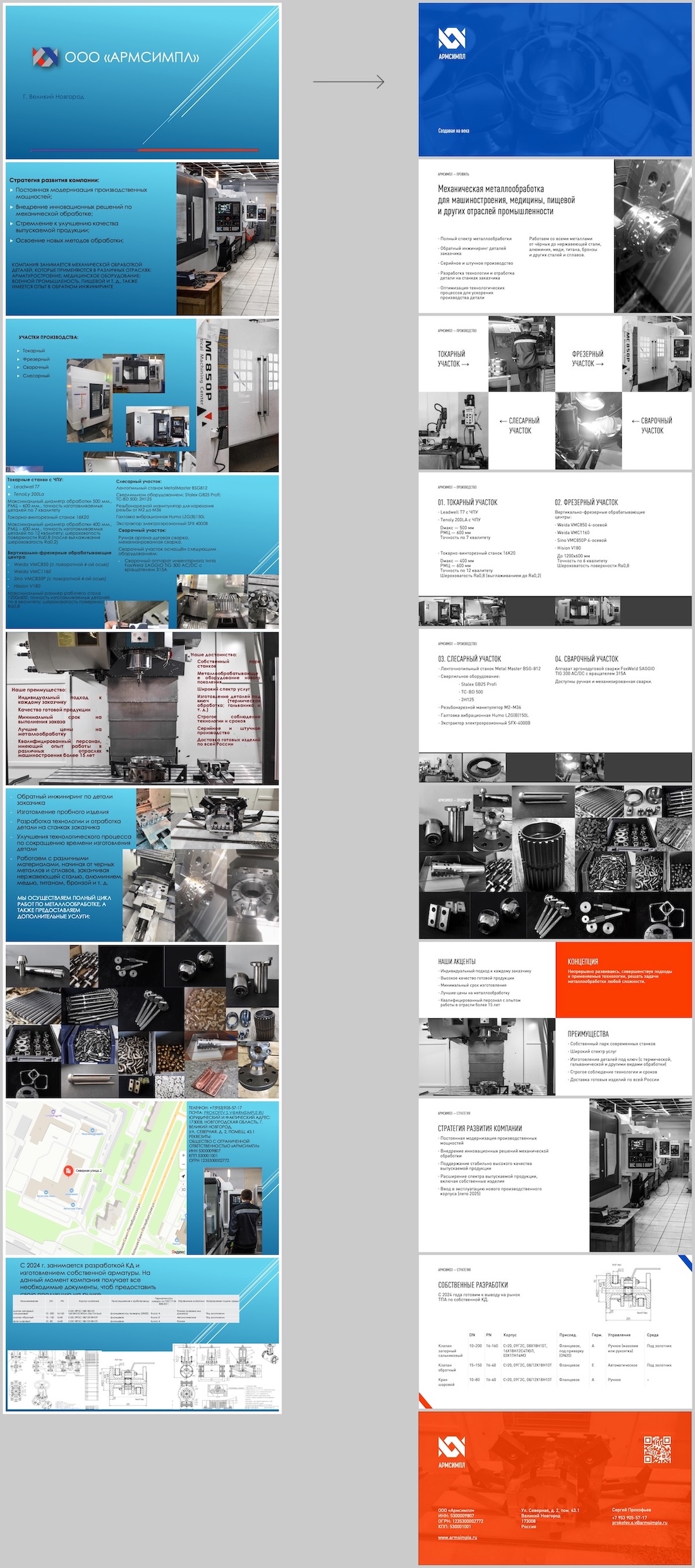
At the end of the work we advised the guys on working with Rospatent. The time to registration was running out. To pass the time, we redesigned a mini-presentation about the company:
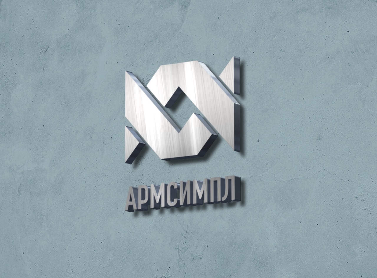
This is what a milled sign might look like:
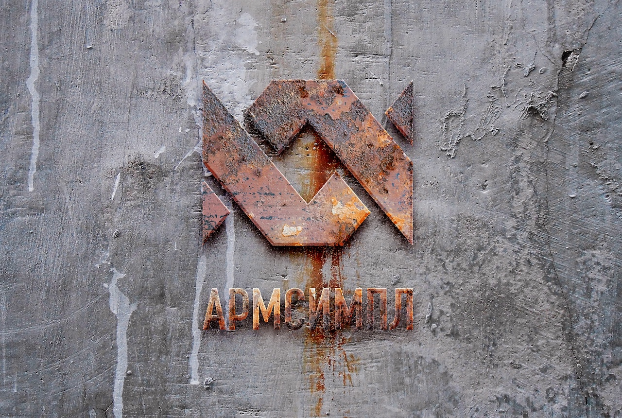
And this is what it will look like years from now in one of the long-forgotten warehouses, when the company will develop and build tens of thousands of meters of new space: